Alright, so this is where the fun part begins...
First off before you start the inking process, you'll want to make sure the pencil lines on the paper are pretty light. Otherwise, when you begin tracing over them with the ink pens, the pen tips may get clogged with graphite and need to be taken apart and cleaned (if you use the fancy kind), if you're like me and use the disposable pens, you'll end up having to throw them out if they get clogged.
So first thing is to take a white vinyl eraser and lightly erase the lines, just to the point of still being visible enough to trace.

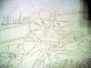
Once the initial erasing is done, you can start to ink. I'm doing this freehanded but if you want to, you could use French Curves or Shippens Curves, which are very easy to use and very affordable. Also, it's important to start with a pen that has a small tip. For this illustration I'm using a Staedtler .03 india ink pen. The reason that you start with the small pen is because with inking you can always add more ink to thicken a line, but you can't take away to make a line thinner. Since I'm using watercolors too, which are very transparent and don't cover the picture plane like oils or acrylics, you have to be very mindful of this as you won't be able to paint over the lines later. (This is actually an advantage, you'll see why in the next part of the tutorial)
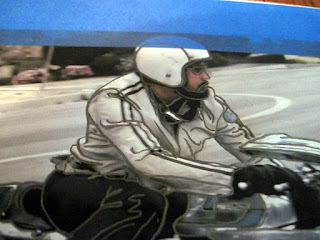
So in the above picture you can see that the lines I've added around the rider are pretty defined and solid. This is because the rider is in the foreground, also, he and his bike are the main subject matter. In the picture below the background objects are drawn very loosely to convey the idea of distance and to attempt to show that the rider is in motion.
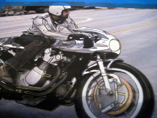
Below is another example of the same concept. Drawing background objects a bit looser to convey distance and that they would be "out of focus" being so far away.
In the middle ground, between the background and foreground, the objects start out less defined as they are further back into the picture, but become more pronounced as they come forward. Look at the lines in the road for example. They are small and insignificant towards the back (the dividing line in the road behind the rider) but become more defined as they come forward (the two remnants of a dividing line to the right of the rider).
Now take a look at the spokes. They are a little bit of a problem that a lot of people would solve differently. The problem is that they are in the foreground, so they should be in focus, but since they are in motion, they should also be out of focus. Tricky, tricky...
What I've done is drawn the base of the spokes closest to the center of the wheels. As they move outwards to the tire they appear to be blurred more, so with a small "whip" of the pen tip, you can create a line that begins solid enough and quickly tapers to nothing. It works very well to go from a defined area to an obscured area in a short distance.
Does this motorcycle look funny to you? Where's the motor? The top tree on the fork?
It's all there, but if you look back at the photo from parts one and two that a lot of the motorcycle is black from the shadows that the machinery creates. So instead of driving yourself crazy, just trace the blocks of color, this will make it look like a "paint by number" but trust me, you'll love it. One thing to remember (and this is just my way of doing it, so if you ever meet a real painter, don't hesitate to listen to them too) is that areas that are highlights should be traced a little larger than the highlighted area. The reason being because when you go to paint with the watercolors, you'll want to try and match the transition from black to white (like on the exhaust pipes for instance) and that gradation, or "fade" will require that the line not be shown too much. You can certainly leave the pen showing when you're painting and not worry about it, or try to fade the shadows into the highlights and cover the lines as you find fit. No wrong way to do this, just fun to try different things :)
After all that, defining shapes and being aware of line thicknesses, solid or loose lines for depth and all the other fun stuff that goes into the drawing with ink, this is really the fruits of you labor. After the ink has dried, which should only take a few minutes from the last place you put you pen tip, you get to take the handy dandy white eraser again and clean up the whole drawing. Erase everything on the entire page and VOILA! All the pencil lines and smudges will be gone and you'll have a very dramatic little pen and ink drawing on a stark white piece of paper. Really fun to do the first time around :)
If you'll notice that I didn't ink the shadow underneath of the bike, that's because I plan on using it to paint over and keep the blurry quality of the shadow intact. This technique can also be used for highlights as well, but when you paint, remember that the water from the paint may wash out some of the leftover pencil lines as well.
Isn't it cool?! Very good, and now the really super awesome part! PAINTING!
One difference from this painting and the others in the motorcycle series is that this was done on watercolor paper and the other ten paintings were done using illustration board. The change in media should make for small adjustments but an interesting challenge as well :)
Enjoy!


